FURNSPACE
Art Direction
Furnspace is an e-commerce furniture brand selling hi-quality solid-wood and upholstered products at democratic prices.
The requirement was to set a visual tone of the images, design the product slideshows and images for social media, emailers and website banners.
TEAM
Year: 2017-18
Overall Visual Concept: Mini Gautam
3D Artists: Pramod Sharma
Graphic Designer: Shravanthi
Copy: Suganya Manivanan
BRIEF
To define and develop imagery for the brand. The look and feel should be sub-premium and represent the high quality of the product.
Target Group: Well travelled and tech savy modern Indians, age group (28-50yrs).
PROCESS
I started with secondary research on what other furniture brands, national and international are following and what all are people visually exposed to while browsing through products on the net.
My direction for look and feel was that the brand
'should look 'solid' and powerful yet warm and approachable'.
SLIDESHOW
Slideshow
For a sub-premium factor, the slideshow images need to be
more than a product image on a white background.
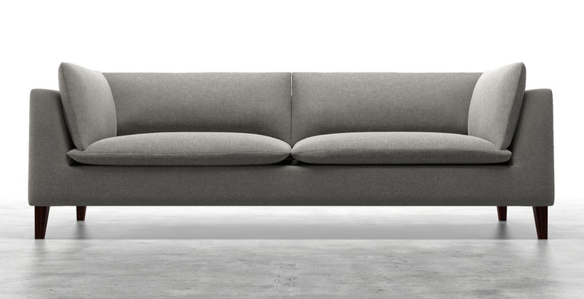
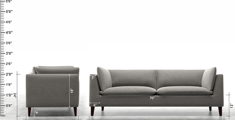
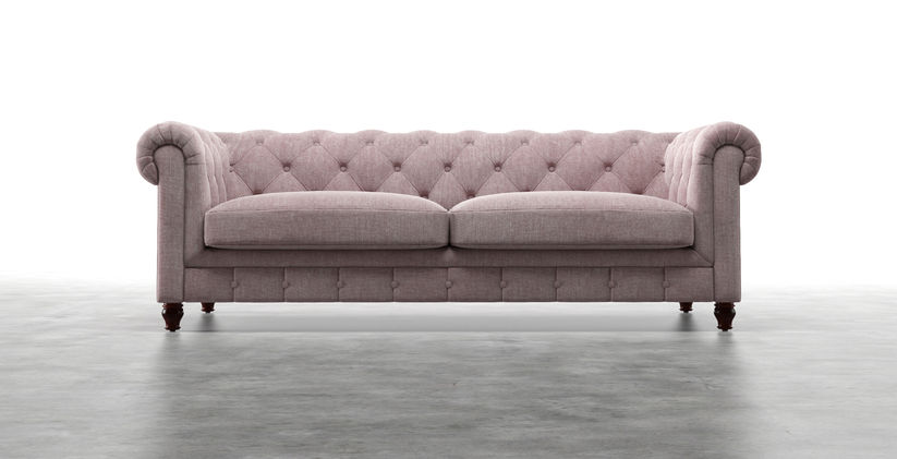
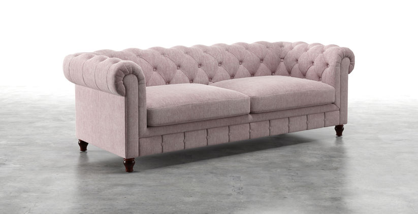
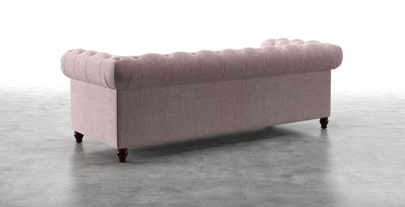
After trying a lot of iterations, we zeroed on the grey floor without any wall. The floor added a perspective to the image and added a sense of space without overpowering the product. The slideshow has 5-6 images per product and the dimensions were marked against a feet scale for a user comparison.
3D render and light
Since it was a 3D render, I experimented a lot with light intensities
and texture size to create a balance between the highlights and shadows and to not make it look digitally developed
and as close to the product as possible.
For social media and promotional offers,
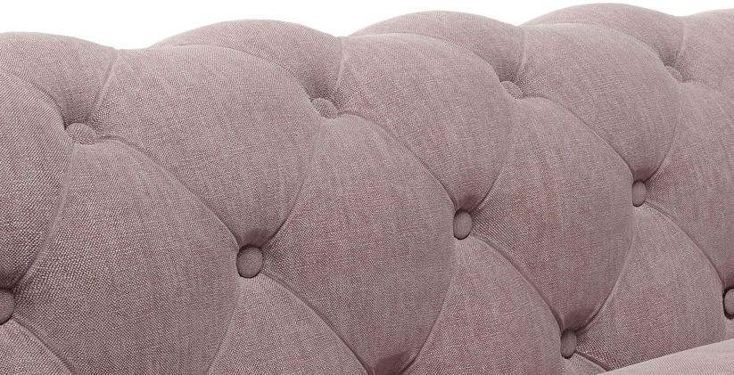
the images were kept minimal in terms of added props and background and look like an extension of the slideshow images. The palette is warm and textural. The lighting is directional and mimics natural light enhancing the texture of the product.
MARKETING

MINIMAL-WARM
This look is all about highlighting the quality and texture of the products. While the background tones of beige, grey and cream add warmth to the scene, the light adds slight high key drama to the setting.
Layering of textures adds depth to the frame. Minimal extra props are used to keep space for text when using for campaigns


For bestselling products, look images in a room setup were rendered to be shared on social media. I also came up with a format to introduce new colours on instagram and facebook.
SOCIAL MEDIA

MILLENIAL LUXE
This look is all about highlighting the quality and texture of the products. While the background tones of beige, grey and cream add warmth to the scene, the light adds slight high key drama to the setting.
Layering of textures adds depth to the frame. Minimal extra props are used to keep space for text when using for campaigns


URBAN CONTEMPORARY
Here the focus is on the basics of line, shape and feel of the product; the overall look is fresh with open space and natural light.
The aim here is to show how the clean lines and slim form of the product will look in a modern simple home.

To introduce fabric range on Instagram
This category of newsletter included content that was about different design style, colour palette and mixing products to get a certain look for the room. The style is very editorial in nature and is designed to have a magazine(ish) layout.
NEWSLETTER


